Author websites are as varied as personalities. But there are some aspects that more successful authors’ websites have in common. To help you create the best possible home for you and your books, we’ve created this checklist of attributes that will help you to make your site a success. At the end of the article, we’ve included a list of eight of the best author websites on the internet for you to review and glean ideas from.
As authors, we’re typically gifted with many skills:
- A knack for language and storytelling.
- Imaginations capable of dreaming away whole days.
- The ability to live for weeks on coffee and snacks.
Notably missing from that list is the ability to design and code stunning websites.
Regardless of our level of tech savvy, however, we live in an age where having an incredible website is not a “nice to have”—it is a prerequisite to any sort of publishing success.
Luckily, designing a website has never been easier. With the wealth of free tools available, and the affordability of professional designers who specialize in author websites, all you need is a working knowledge of what makes a good author website. Below, we’ve broken down a checklist of design principles to follow, and common mistakes to avoid, starting with:
1. Make Your Book The Center of Attention
99% of your visitors are going to come to your site because they are curious about your book. It follows logically that your book needs to be the first thing they notice when your homepage loads.
Your book cover should be front and center, and it should be impossible for the reader to navigate to any other part of your site without knowing that this is the digital home of your book.
Mark Sullivan is a Wall Street Journal bestseller, and his homepage follows this principle precisely:

2. Do Not Make Your Website Your Facebook Profile
A common mistake among authors is to build a website thinking:
“My readers are here for me.”
Unless you’re Toni Morrison-level famous, your readers are on your site because they like your books, not because of your charismatic personality. One of the biggest mistakes you can make is to orient your site around yourself instead of your book.
That means your homepage can’t consist solely of your headshot and author bio. In fact, as a rule of thumb, you need at least two images of your book for every headshot of yourself that you include on a page.
3. Make It Easy To Buy Your Book
You promote your writing for a number of reasons. You’ve spent years perfecting your craft, and now you want to share it with people. You like the sense of community publishing brings. You believe in the value of the literary tradition.
You also, however, would like to sell some books.
You would not believe the number of authors that throw up a website that doesn’t include a single “Buy The Book” button—not even a link to their Amazon page.
Make sure your readers can easily buy your book with as few clicks as possible by placing direct links to your book’s page on major retail platforms.
Tayari Jones, the beloved author of Leaving Atlanta, designs each of her book pages to have this row of purchasing options featured prominently on the page:

4. Do Not Turn Your Website Into A Nonstop Sales Pitch
While it’s important that you make it easy for people to buy your book, turning your website into an unnavigable forest of opt-ins, pop-ups, and “Click Here To Buy” buttons will do nothing but infuriate your readers.
Your website is there to help you sell books, but also to connect with your readers. These two objectives are codependent, and if you fail at one, you fail at the other.
5. Extend Your Book’s Aesthetic To Your Website
If a reader is curious about your fantasy book, your website should be every bit as fantastic as your writing. You want people who feel at home in your stories to feel at home on your site, and the best way to do this is to make sure your aesthetic translates across both platforms.
A very simple but effective example of this is V.E. Schwab, author of A Conjuring of Light:

Looking at that site, the font, colors, tagline, and basic imagery immediately signal to you that this is a strange, fantastic world you’re about to enter.
6. Do Not Overemphasize How “Professional” You Are
Too many authors design their websites to prove that they are a “real, professional author.”
I’m not going to include any photos, because that would be mean, but we’ve all seen those terrible, cliche “author headshots” of an author standing next to a fireplace like they’re about to pen their next Dickensian play.
No reader in the history of publishing has bought a book because the writer’s headshot looked “writer-y,” or because the writer listed an obscene amount of certifications, degrees, and associations in their author bio.
7. Give Your Readers An Easy Way To Contact You
We’ve already discussed that one of the key goals of your author website is to foster a connection between your readers and yourself. Connections are two-way things, which means readers have to be able to contact you.
This is tough for a lot of writers. As authors, it’s already hard for us to make enough time to write. Inviting another distraction to take away our writing time is not high on anyone’s list of priorities.
However, readers have to be able to reach you to feel connected to you. Setting up an email account dedicated to fan mail and blocking 1 hour a day to respond to it isn’t as bad it sounds, and throwing up a “Contact Me” page takes roughly 30 minutes of time total.
Besides, good fan mail can be a fantastic motivator when you’re struggling to get going.
8. Do Not Neglect To Respond To Your Readers
This isn’t technically a design tip, but it relates to making it easy to contact you. Do not put up a contact form or list an email address, and then neglect to engage with the people who reach out to you.
The only thing worse than not being able to reach out to an author is to send an author a heartfelt message about how much their work means to you, and receive nothing in return.
If you’re really extremely busy, block an hour or so every other day to respond to emails, and set up autoresponders with a nice message and possibly some free snippets of writing to make sure your readers get some sort of response immediately after reaching out to you. You can using ConvertKit or whatever email platform you prefer to do this easily.
9. Update Your Site Regularly With A Variety of Content
Getting a visitor to your site in the first place is a big win. The internet is a big place, and getting a reader curious enough to hunt your site down means you’re doing something right.
Getting your visitors to come back over and over again is the holy grail. The more times a reader visits your site, the more they invest in your brand, and the more likely they are to become a lifetime fan. Getting a reader to revisit your site can also, unfortunately, be difficult.
You keep readers coming back by giving them a reason to return—and that means offering new content for them to consume. Luckily, you’re a writer. Creating new content should be easy.
Write articles sharing your thoughts on writing, review other books, host interviews, publish sneak peeks of your next books—do whatever it takes to create new, high-quality content that your readers will love.
Roxane Gay—actual superhero and bestselling author—set up a Tumblr account as the “News” section of her site, and consistently blogs there on the same topics she writes her books about:

10. Do Not Turn Your Site Into A Content Mill
The easier-but-self-destructive version of what Roxane Gay does is turning your site into a content mill. This is what happens when an author throws up a blog, neglects to write anything, panics, and tries to outsource all of their content cheaply.
What you end up with is dozens of 500-word fluff pieces on a bevy of almost-but-not-quite related topics. No reader is going to feel connected to you after seeing that. In fact, they’re going to feel more distant than they did before visiting your site.
11. Give-And-Take With Free Writing
In digital marketing, marketers often use “lead magnets” to entice customers to sign up for email lists. Have you ever been browsing a site, when a little form slides in from the corner of the page, offering you a free guide to something or other if you input your email address?
That is a lead magnet, and it is a fantastic way to get people to sign up for your email list. This is incredibly important, because email is the most effective marketing channel when it comes to viewers actually spending money.
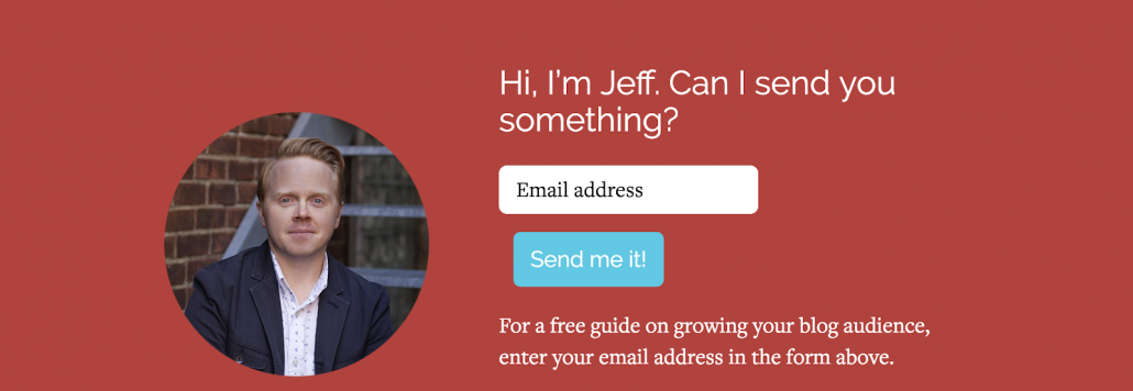
Your writing is the best lead magnet in the world. People are coming to your site to learn about your books, and if they can simply input their email address to get an excerpt of a book, a new short story you’ve written, or a sneak peak of something you’re working on, they’ll gladly do it.
Jeff Goins, the best-selling author of books on marketing like Real Artists Don’t Starve, is appropriately good at this:
12. Do Not Ignore Your Website’s Load Time
This one is a bit more technical, but it’s so important. As authors, we’re artists, and sometimes that means we like to load our pages up with beautiful, high-quality images and other artistic assets that, while easy on the eyes, are hard on the server.
A slow loading page will crush your site, no matter how well designed it is. 47% of people expect a site to load in 2 seconds or less. Is your site that fast?
The Greatest Book Still Needs An Audience
Your site is the online home of your book. It’s the place where readers research your book before buying it.
However, in order for your site to effectively build relationships with your readers and move copies of your book, it needs to be designed correctly. Now go forth and host your new site!
8 Fantastic Author Websites To Inspire You
As a little bonus, we’ve put together a list of 8 great author websites from some of the best in the business, just to give you a little inspiration.
1. Jordan B. Peterson Puts His Book Front And Center
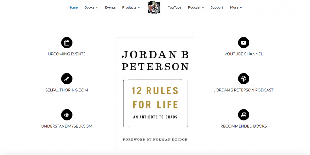
Jordan B. Peterson is a psychologist and author of the bestseller 12 Rules For Life. His website is the perfect example of putting your book front and center—literally. You can’t do anything on his site without seeing a massive copy of his book in the center of your screen, and if you click it, you’re taken to its sales page.
Readers are coming to your site to learn about your book. The more you can make your book the focal point of your site’s design, the more successful you’ll be.
2. Melinda Leigh Uses Her Book As A Lead Magnet

Signing up readers to your email list is a massive deal in the book marketing world. Email converts to sales better, and having a reader’s email means you can continue to email them about every book you release in the future.
Giving your reader a free snippet of your book—especially an unreleased one—in exchange for their email address is an awesome strategy for building out your email list. Even if you’re not very code savvy, tools like SumoMe or ConvertKit make it incredibly easy to setup simple opt-ins like this in minutes.
3. Dean Koontz Does Not Emphasize How Professional He Is

If anyone was going to brag about how professional they are as a writer, it would be Dean Koontz. The man has 14 New York Times bestsellers to his name.
His site, also, makes no mention of this on its landing page. It’s all about the books—not showing off to other writers. If Dean Koontz isn’t bragging about his 14 New York Time bestsellers, you have nothing to brag about on your landing page.
Also, note that he doesn’t feature a massive picture of his headshot on the landing page like so many other authors.
4. Jennifer Niven Keeps Her Aesthetic Consistent

One of the big mistakes I’ve seen authors make over and over again with their websites is adopting a sleek, professional design—in total conflict with the aesthetic of their writing.
Jennifer Niven, bestselling author of Holding Up The Universe, does not make this mistake. The fonts, the colors, the stylings of her graphics—all of it is completely consistent between her site and her book.
The result is an immersive, comfortable experience for readers who love her writing.
5. Kevin Hearne Keeps His Site Updated With New Content

Readers need a reason to come back to your site, and that reason is the promise of new information. Whether it’s a blog post, updates about your new books, book tour information, or new social media posts—your readers need to be stimulated with new information.
Kevin Hearne, author of Scourged: Iron Druid Chronicles, does a great job of this. Not only does he post new updates about his upcoming books and tours, but he keeps an entire section of “Goodies”—essentially free bonus material—that he updates frequently.
On top of this, his social media feeds automatically are displayed on his homepage, meaning readers can see new content every time they view the page.
6. Karen Marie Moning Makes It Super Easy To Get In Touch

Readers want to be able to contact you. If they’re reading your books, browsing your site, signing up for your email list, etc., they should be able to get a hold of you and tell you how valuable your books have been.
As reclusive as us writers can be, engaging a reader one-on-one is an opportunity to turn them into a lifelong reader and friend. They have to have an easy way to contact you, and Karen Marie Moning does a phenomenal job of this.
Not only does she give you an easy to use form, but she includes a general email you can message, as well as a list of her upcoming events, in case you’d rather meet her in person.
7. John Irving Builds A Brand—Not A Sales Pitch

A great mistake writers tend to make is that they turn their website into a never-ending onslaught of sales pitches. This isn’t ghostwriting—you aren’t trying to sell services to anyone. You’re trying to build a digital home for your writing, where readers can connect to it better.
Yes, ideally that would include buying your book, but spamming your reader with sales pitches will not encourage them to purchase your book. It will push them away.
John Irving is exceptional at this. He pushes his brand without forcing you to make a buying decision. Instead, he creates an experience his readers will find pleasant—one that probably leads some fans to buy, but certainly makes all fans feel at home.
8. Jon Krakauer Makes It Incredibly Easy To Buy His Books

When your reader has to click through multiple pages just to figure out how to buy your book—you have a problem.
You need to remove all friction from your reader’s buying experience. When they visit your site, they need to have an option to buy your book right away, not as a spammy pop-up—remember, your site shouldn’t be shoving sales material down your readers’ throats—but with a noticeable button.
Jon Krakauer does a great job of this. The button isn’t ostentatious, but because of its color, is extremely noticeable. As a bonus, when you click the button, you get a very easy purchase form:

That’s exactly what your readers need. An easy, smooth way to buy your book the moment they decide they want to.